Neil Weaver
Personal Background
Neil Weaver was born in Michigan. He started taking landscape and nature photos in 2001, when he was 21, though he was interested in art for some time and had begun to take photos occasionally in high school. His first experiences taking landscapes were at Lake Superior State University, where he was attending school. Shortly after borrowing his mom's camera, he bought one of his own.
Style
Weaver's style tends towards the dramatic, often involving wide angles. He takes few detail photos, though those he does take are usually more homely and less dramatic than his other work. Usually, he prefers grand scenes from nature, like waterfalls and the insides of caves. He sometimes includes architecture, like bridges or handrails, in his shots, but just as often, the subjects of his photos are entirely naturalistic. He treats architecture with the same wide angles and grandeur as his landscapes.
Philosophy
Weaver photographs Michigan due to his childhood experiences. His parents used to take him and his sisters to various places outside, like lighthouses, bridges, and shores. He feels drawn to such areas, and finds photography to be a good way of expressing these feelings. He believes he should only photograph things he finds personally inspiring.
Influences
Weaver's landscapes have influenced me to take more photos of such scenery myself, with his depictions of icy landscapes often translating directly to my own. His grander pictures haven't had much impact on my style, but his detail shots have inspired me towards more detailed pictures of my own. The use of color in his work, often using blue tones offset by oranges, has led me to adopt a similar approach. He takes many photos of his home state of Michigan out of a personal fondness for it, as do I, though my photography tends to be of common cityscapes rather than of natural landmarks or large-scale architecture. His high-contrast imagery has influenced mine as well.
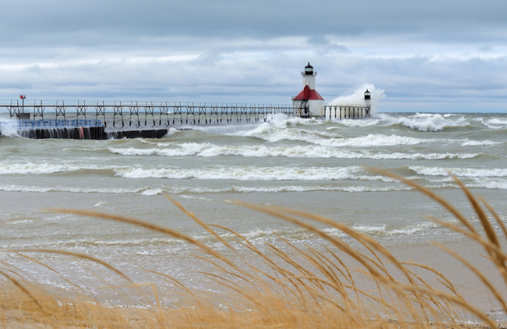
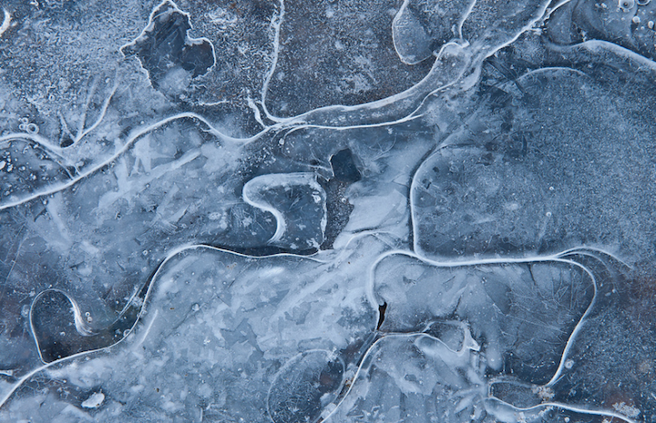
"Angry Lake" (original)
|
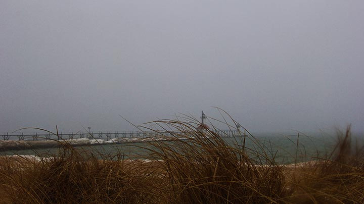
"Melancholy Lake" (recreation)
|
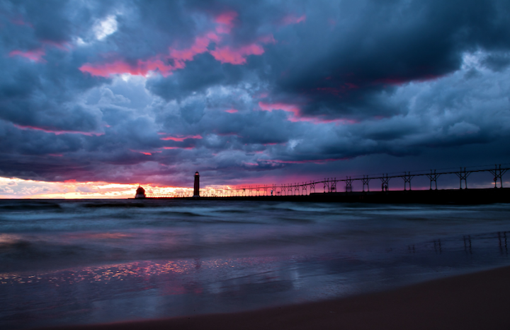
"Final Act" (original)
|
"Final Project/Final Act" (recreation)
|
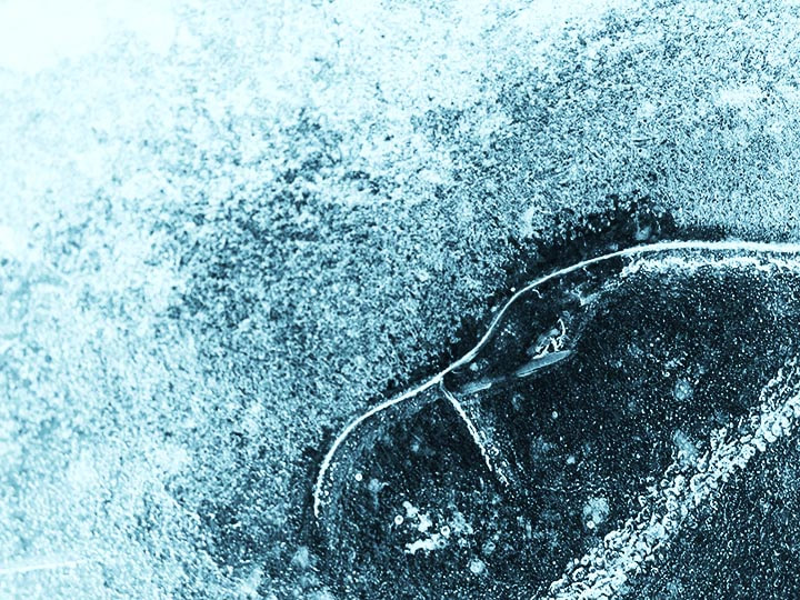
"Elements of Design" (original)
|
"Elements" (recreation)
|
Sources
Compare and Contrast
My pieces look moodier and less inspiring than Weaver's, perhaps due to the wintery environments in which they were taken. The colors are darker, bluer, lower-contrast, and less-saturated. "Melancholy Lake" was taken while the lake was foggier than it was for "Angry Lake," while the environment of "Final Project/Final Act" was less cloudy and pre-sunset compared to that of "Final Act." "Elements" is less intricate than "Elements of Design," but has an appeal all its own. In terms of comparison rather than contrast, my images are from the same places as the original, other than "Elements" being taken in a different place than "Elements of Design," which was due to its being a detail shot of ice rather than a landscape photo.
Personal Artist Statement
"Melancholy Lake" is meant to feel mysterious and intriguing, but somewhat sad at the same time. It does so through its lack of contrast and desaturated colors, combined with a color scheme tending towards blues, with only the grass in the foreground being a warmer color. "Final Project/Final Act" uses a higher-contrast, more-saturated, brighter color to convey a feeling of adventure and inspiration. "Elements" is more personal and interesting to look at than anything else, being a close-up detail with a close focus on its subject rather than having the wide angle of the preceding shots.
